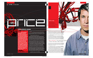
Here are some examples of layouts where shapes have been cut into the body text to create an interesting graphic style in the layout.


Here are a few examples of magazine layouts with a strong grid structure which is clearly visable and effective.


 I included this layout because I thought the overlap of colours to make the heading stand out was very interesting and could influence a few of my ideas.
 These magazine layouts were collected from http://bestdesignoptions.com
No comments:
Post a Comment